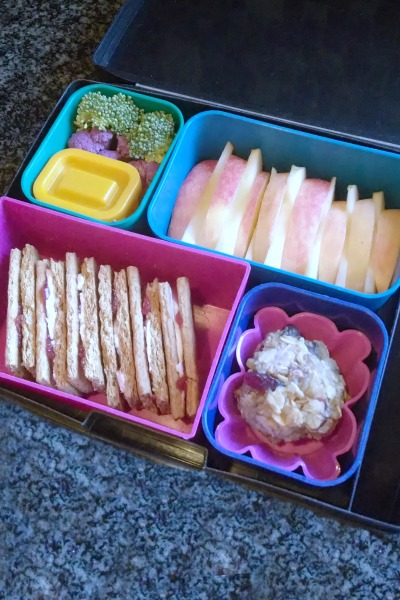
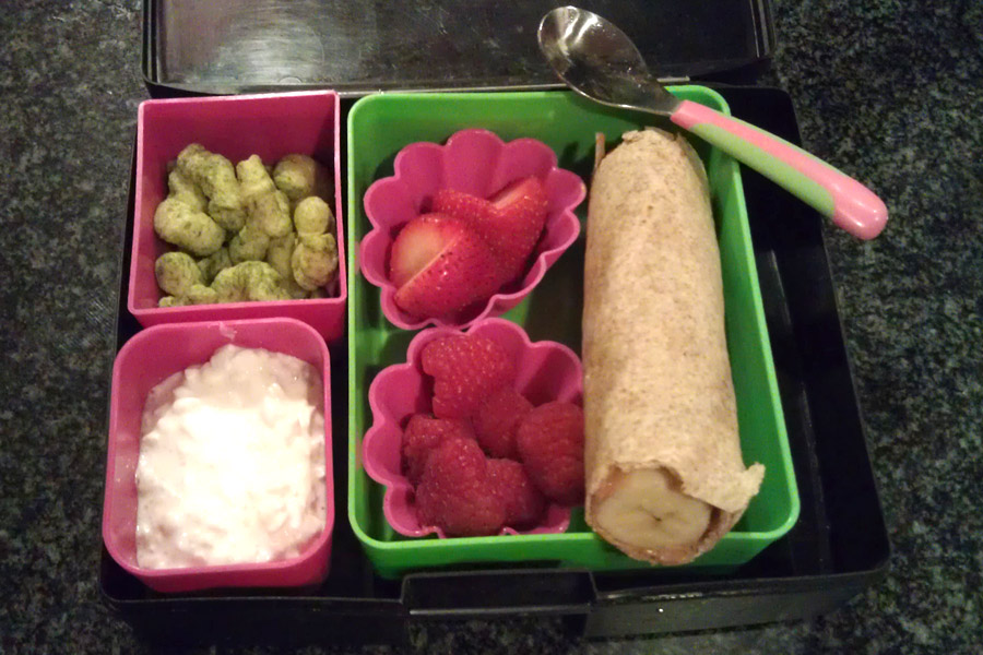
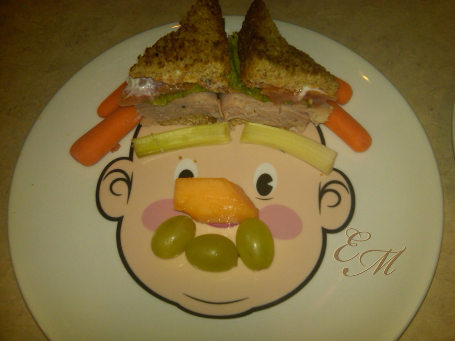
It’s funny what sort of things appeal to me. Apple slices thrown haphazardly into a container is just not as appealing as apple slices lined up in a container in a nice orderly straight line. They – whoever they is – say we eat with our eyes first. I kind of agree. I try to keep this in mind when packing lunch for Madeline every morning.
I’m certainly not an amazing bento mom turning turkey sandwiches into profiles of cartoon characters or rice and vegetables into intricate garden scenes, but I do like to have things look at least appealing. It jest seems that a visually appealing lunch is a more kid-friendly lunch. It doesn’t have to be fancy, to look good. A ruffly edged flower shaped pink silicone cupcake liner not only holds the homemade quinoa ball in place helping it keep its shape but also adds a bit of fanciness to the snacky side dish without any added effort on my part. When packing lunch I just can’t seem to let things go into the box all willy-nilly. I need a little order and symmetry.
What’s in the Laptop Lunch Box: Graham Cracker Sandwiches
Graham cracker sandwiches made with organic graham crackers, cream cheese and raspberry jam
Trail mix quinoa ball
Apple slices
Purple cauliflower, broccoli, and pomegranate balsamic vinegar for dipping
What tricks do you use to make your kid’s lunch more appealing?

